Why Typography Choices Make or Break a Brand
Date
Dec 1, 2025
Category
Typography
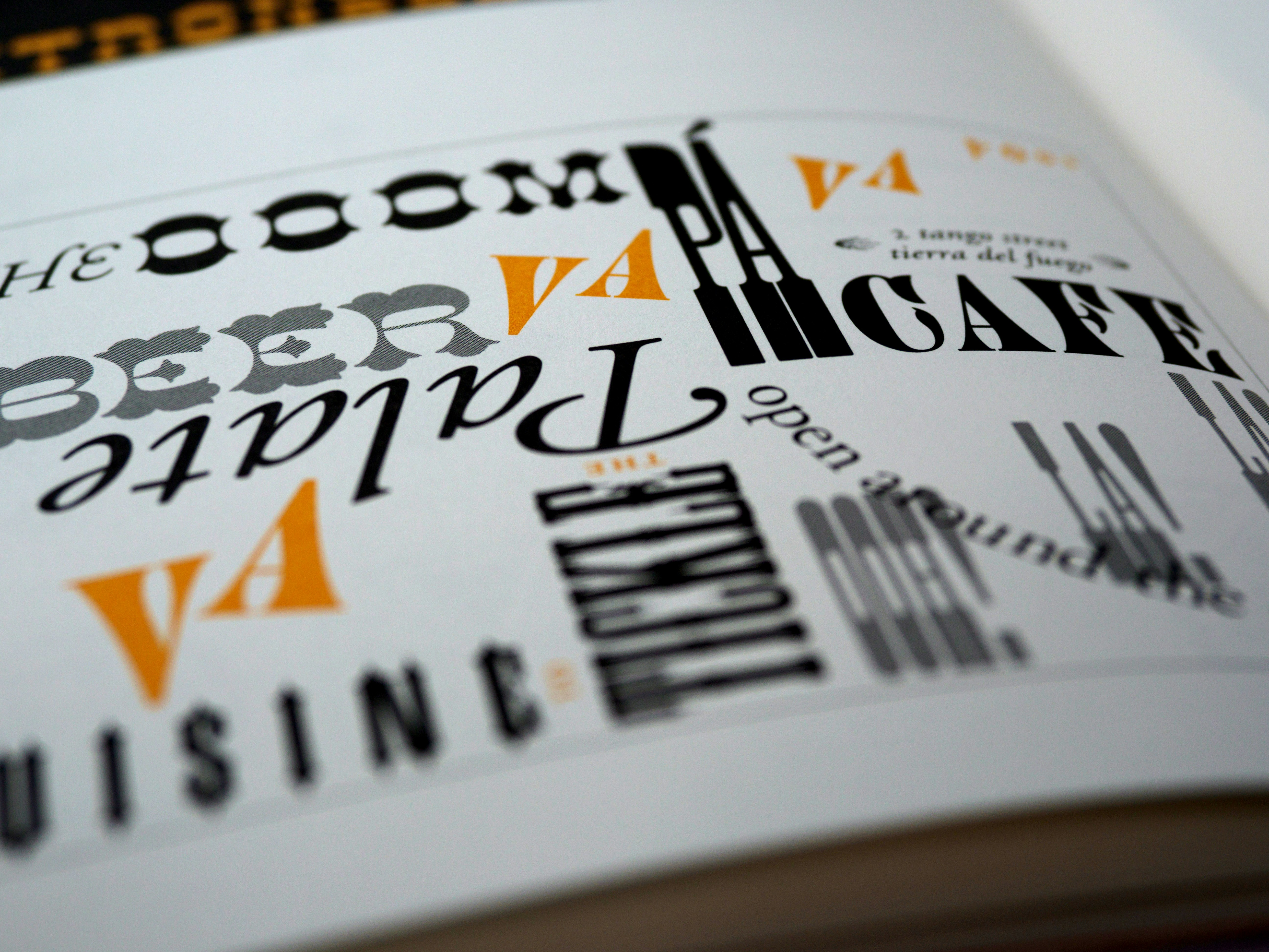
Overview
The Problem Most brand builds spend weeks on the logo and minutes on the typeface, treating type as a formatting decision rather than a brand decision. But type gets seen more than the logo ever does — every headline, every button, every line of body copy inherits its personality from the typeface underneath.
The Fix Choose typography with the same rigor as the logo — test it at the sizes it'll actually be read at, across the range of content it needs to carry, and against the emotional register the brand needs to hit. A typeface is a voice; treat the selection like a casting decision, not a formatting one.
Weak Online Presence
Pairing Without a Plan Two "nice" fonts stacked together isn't a system — without a clear hierarchy rule for what's a headline, what's body, what's a UI label, pairings collapse into visual noise the moment a new page gets built by someone other than the original designer.
One Typeface, a Dozen Interpretations A typeface that looks premium in an 80px hero headline can look thin and cheap in an 11px disclaimer. Type systems need to be tested across the actual range of sizes they'll be used at, not just the sizes in the pitch deck.


The Takeaway Type is doing more brand work, more often, than almost any other single decision in the system — it just doesn't get treated that way.
Do This Next Pull up the smallest and largest text on your site side by side. If they don't feel like the same brand, the type system isn't finished.